Lateral
ABCDEFGHIJKLMNOPQRSTUVWXYZ
abcdefghijklmnopqrstuvwxyz
0123456789 .,:;!?&@*
Condensed BoldRegularLight
Headlines · Body · Copy
Primary font
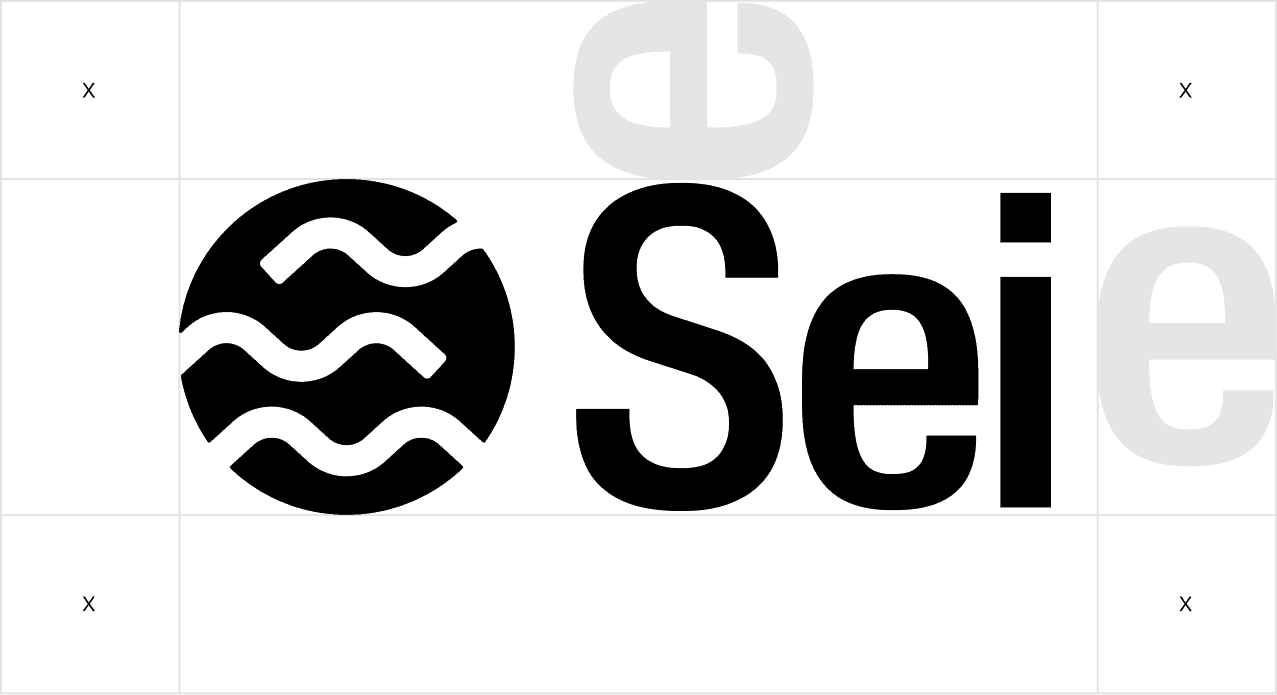
The Sei primary lock-up consists of two elements: the symbol and the wordmark. This lock-up is the main representation of the brand and should be used consistently as a combined unit.
Black and white carry the brand. Maroon and Gold are heritage accents — use them only for emphasis and legacy moments, never as the base palette.
Primary Palette
Neutral Ramp
Lateral is our primary typeface. Use it for headlines, product UI, and anything that needs presence. Give it room when setting editorially.
ABCDEFGHIJKLMNOPQRSTUVWXYZ
abcdefghijklmnopqrstuvwxyz
0123456789 .,:;!?&@*
Condensed BoldRegularLight
Headlines · Body · Copy
Primary font
ABCDEFGHIJKLMNOPQRSTUVWXYZ
abcdefghijklmnopqrstuvwxyz
0123456789 .,:;!?&@*
Book
Editorial · Quotes, captions, Foundation headlines
Secondary Font
ABCDEFGHIJKLMNOPQRSTUVWXYZ
abcdefghijklmnopqrstuvwxyz
0123456789 .,:;!?&@*
Regular
Data · Tickers, block heights, CTAs, captions
Tertiary Font
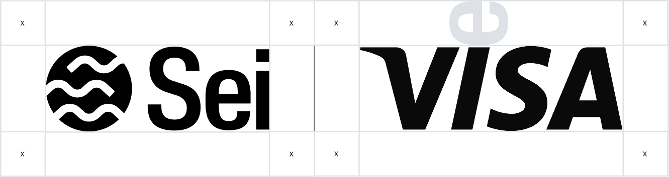
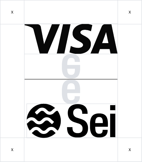
To maintain our logo's clarity and prominence, follow the clearspace guidelines.
Our lockup for brand partnerships are dictated by the clearspace rule, which should also be applied to the partner brand. Ensure both lock-ups are the same height.